Hazards
of
Corp
Design
27 Sept ‘22 | 8 Min. Read

Design challenges
It is more important to communicate insightful intelligent ideas in uniques memorable ways than to create the visual equivalent of a scientific diagram where you accurately and painstakingly explain why your product is better than your competition...
With some notable exceptions, why does a majority of corporate design end up being so bland and uninspiring?
A website or catalogure designed with swiss typefaces & monochromatic colours can work wonderfully. Thats not what I’m talking about here.
I’m referring to those sites that look like they came off a template factory with absolutely nothing new or unique to offer the visitor.
the Question
Let’s begin with a question. A fairly easy one.
Of the two cars shown below, which one do you think was designed by a planning committee and focus groups? And which one was the product of a single designer’s vision?
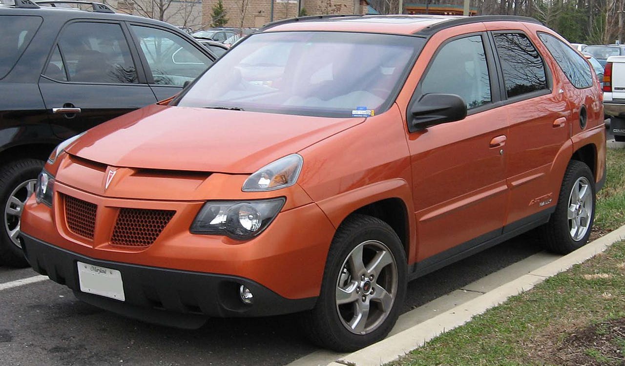
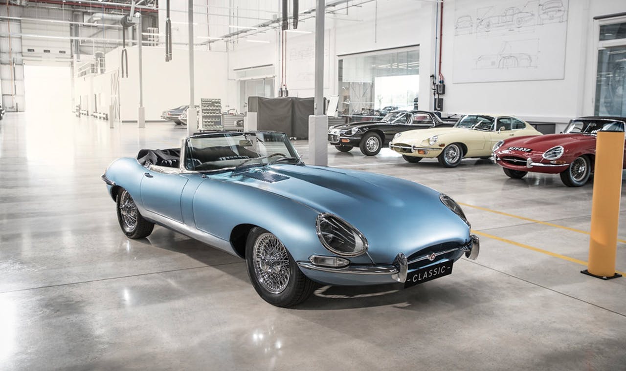
clue: THEre’s only one right answer here...
If you picked the Jaguar E-type (the beauty in blue), you are absolutely correct and if I might add, are a person of excellent taste & refinement.
The Jaguar is in fact, considered by many to be one of the most beautiful automobiles ever created, even by today’s standards. I mean, just look at the thing.
The Pontiac Aztec on the other hand, is often used by internet meme creators as a humorous example of terrible aesthetics and product design gone horribly wrong.
This provides a nice segue into today’s topic of discussion, why so much of corporate design tends to look & feel so uninspiring, lifeless and for lack of a better word, downright boring. (Note to self - must try and not turn this into a rant)
I feel I should clarify what I mean by the term, ‘Corporate Design’ here. The term typically refers to medium-large for-profit companies. These could be anything from tech start-ups and mid-sized business consultancies to established global public limited companies.
1. Design by committee
2. Micro-managing The Design
Design by committee is when a company reliers on an internal team to manage and guide a design project with the well intentioned thought, many hands are better than one. Unfortunately, this almost always spells disaster as each individual feels the need to justify his/her presence by providing some feedback on the design.
This opens the floodgates prompting the less assertive members to chime in altering every element, forcing the designer to work through multiple rounds of changes until slowly but inevitably, we’re left with something that is barely recognisable and is totally lacking in character and personality.
Instead of an organic design that is more than the sum of its parts where each element from the grid, typeface, colours, images and animations all worked together, we now have a jumbled discordant mess.
Moreover, most of the time the suggestions will come from people with little to no design expeirence themselves. So, naturally their feedback will be based on what they’ve seen on the web on their competitors websites.
So, instead of an original design that stands out from your competition you will end up with one that emulates them and blends right in which defeats the purpose of creating a new design.
An authentic design vision thought up, created and refined by a single designer will always outshine and outlive something designed by committee. And while criticism and feedback can be immensely helpful and constructive, designing by committees is most definitely not.
This phenomenon has become so commonplace, that a cursory google search will yield a gold mine of memes and youtube skits.
Our second reason, Micromanagement of the design process is a bit harder and less obvious to identify but just as potent and impactful.
This usually happens when dealing with a company where higher management heavily inject their own personal design preferences into the design process and every little detail of the design.
Don’t get me wrong here. If you’re dealing with a charismatic trailblazer who’s founded a startup following his passion for an interesting product or service, their detailed project brief can help you create something truly beautiful and memorable.
The problems start appearing when the client begins to interfere with the design process itself insisting on seeing the initial mock ups, asking for a few simple changes and before you know it, they’re the ones creating the design. In fact, if you’re not careful, they’ll have you re-create their old website bit by bit (a comically sad but true story).
Moreover, if you end up dealing with a founder from a more technical conservative background, you’ll end up with a typical clichéd corporate site that is for lack of a better word, boring.
It’s hardly surprising. In a world where almost everyone dresses the same, writes the same kind of emails and attends the same kind of social gatherings that they would try and create a design following this philosophy of same-ness forgetting that the whole purpose of the brand or website is to stand out, not to blend in with the other hundred similar companies out there.
“It is more important to communicate insightful intelligent ideas in uniques memorable ways than to create the visual equivalent of a scientific diagram where you accurately and painstakingly explain why your product is better than your competition leading to a design that is lifeless and uninspiring.”
It is more important to communicate insightful intelligent ideas in uniques memorable ways than to create the visual equivalent of a scientific diagram where you accurately and painstakingly explain why your product is better than your competition leading to a design that is lifeless and uninspiring.
This was a hard won lesson for us, realising that it wasn’t just enough to create good design. More than half the battle is won or lost in dealing with the client and convincing them that corporate does not have to be boring and the same as everybody else.
And while not every design needs to have crazy animations or funky editorial grids, if designed with heart and soul it will, like the lovely jaguar e-type shown above, end up looking and feeling captivating and timeless.