An
Authentic
Handcrafted
Experience
design challenges
Messaging that is on point with content that is concise blended with design that conveys both, depth & subtlety.
The Client
In early 2017, we were approached by a capital advisory and strategic consultancy based out of Mumbai. They provided comprehensive solutions ranging from Finance, HR, Sales and Strategy to Tech Implementation, helping these businesses to not just react to change but to embrace it.
The firm was founded by two senior partners who brought more than 3 decades of combined industry experience in Senior Management roles with some of the leading Fortune 500 companies. This experience gave them a unique outlook into the challenges faced by these businesses.
The Brief
The clients needed a complete print & digital solution from their initial Visual Identity & Stationery to an interactive website & blog to communicate their services and engage with clients.
Hailing from finance backgrounds, the partners had already picked their company’s name, ‘Bullmonk’. They wanted to create a new brand and website around the dual qualities of this word, combining the strength and passion of a bull with the wisdom and serenity of a monk.
They wanted their digital presence to be equally unique and definitely didn’t want a typical clichéd corporate website. It had to be different and playful but still relevant to their audience and professional.
Services Provided
Branding
- Visual Identity
- STATIONERY DESIGN
DIGITAL
- ART DIRECTION
- CONTENT WRITING
- Custom AnimationS
- FRONT-END DESIGN & Dev.
- CONTENT MANAGEMENT SYSTEM
- Custom blog design

the INSPIRATION
DUAL PERSONALITIES
Finding inspiration for some branding projects can be a real challenge. In this case, we got off easy. We already had a distinctive name to work with.
Having already immersed ourselves in the industry research, we began by putting pencil to paper, sketching out several concepts until we had our final three shortlisted selections that encapsulated the Bullmonk concept, each in its own way.
The research
Our messaging would need to be concise and to the point with a bit of depth & subtlety.
Our target demographic was the senior mgt. in various Fortune 500 companies in India. They were highly educated, typically over 50 years of age and would appreciate an intelligent concept with a bit of depth and subtlety.
we also realised the messaging would need to be concise and to the point since our audience would not spend too much time reading clichéd marketing literature.
shortlist
& final selection
We shortlisted and presented three concepts. Two graphical shapes depicting the silhouette of a monk sitting on a bull and one minimal line drawing split down the middle.
While the client loved all three concepts, they ended up selecting the minimal line drawing logomark for their identity.

PRINT DESIGN
STATIONERY
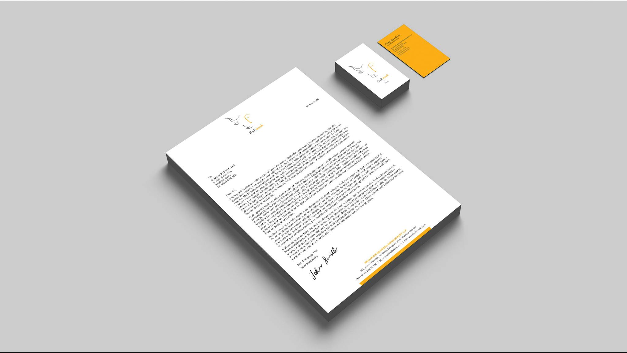
In addition to creating the logomark and brand guidelines, we were also tasked with creating Bullmonk’s office stationery designs.
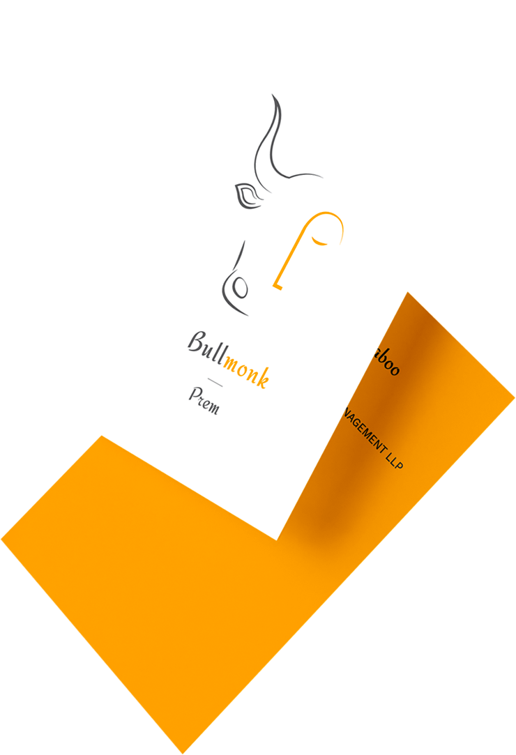
We created a matching set of vertical business cards, A4 letterheads and envelopes with yellow hued accents to draw attention where required.
Digital DESIGN
a theatrical web experience
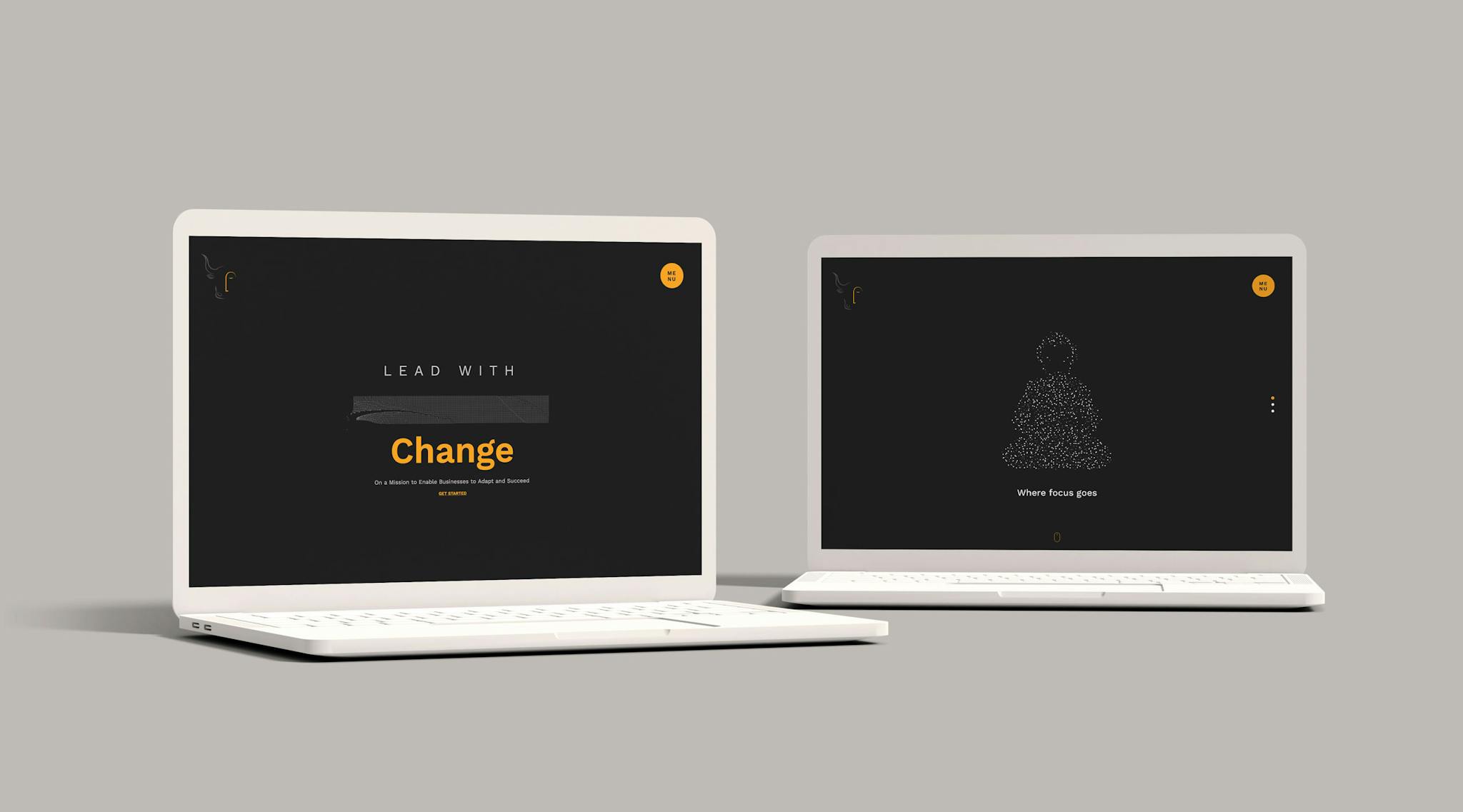
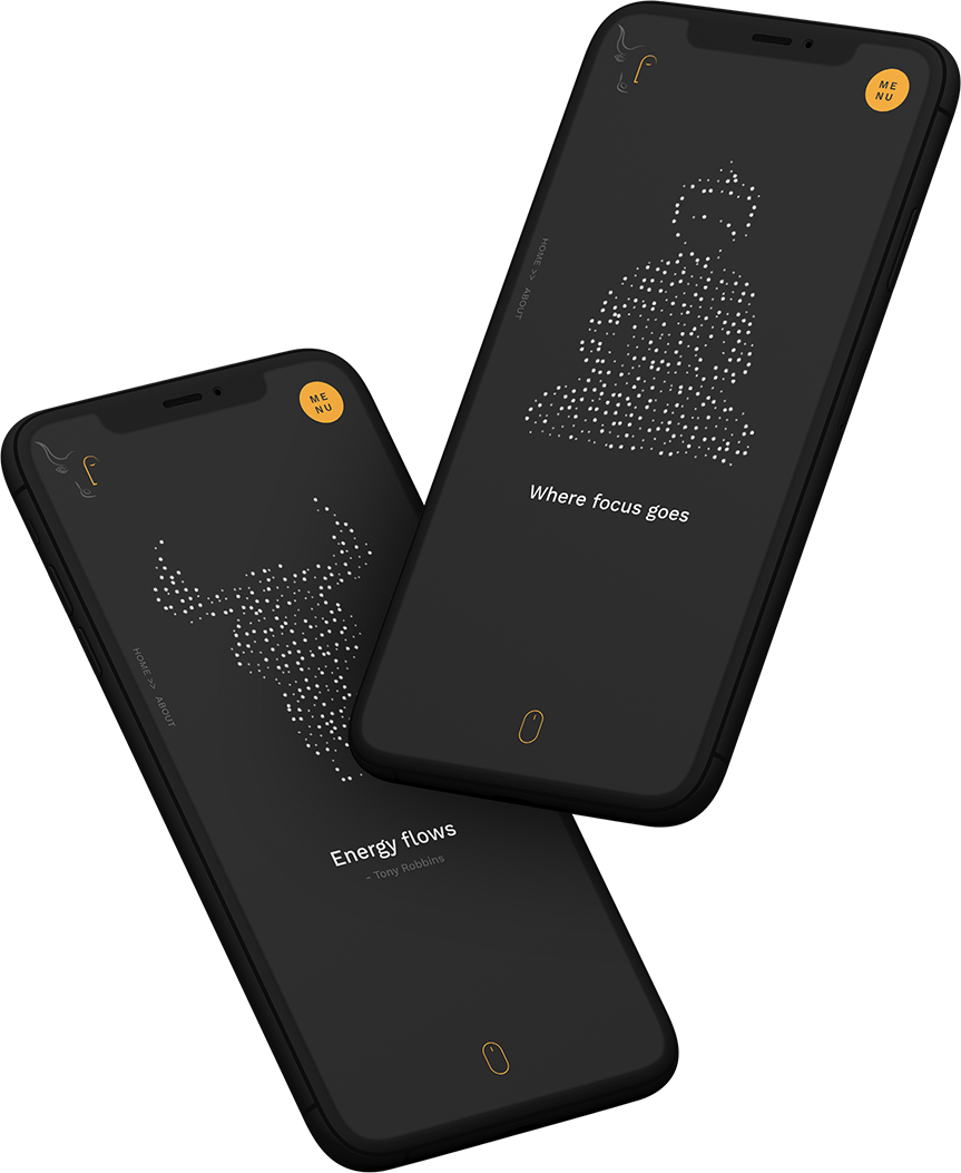
Next, we began work on their website, working with particle animations to create a minimal but theatrical homepage effect where the particles dispersed on mouse hover but then re-formed the shape.
We continued this particle theme on their inner about pages combining these effects with panoramic black & white images with grey overlays letting the focus naturally fall on the content.

Project Outcome
After finalising concept one, we developed a comprehensive brand guideline and stationery designs for their business cards, envelopes, letterheads, etc.
The site had a successful launch, getting shortlisted and winning several international design of the day awards.
This in turn helped bring considerable traffic to the site with over 4,500 unique visitors within the first month, generating significant interest in the Bullmonk brand.
Awards won
- Design Awards Asia
- Design of the Day
- CSS Fox
- Favorite Fox
- CSS Design Awards
- Special Kudos
- Awwwards
- Honorable Mention

But wait, there’s more...But wait, there’s more...But wait, there’s more...But wait, there’s more...But wait, there’s more...But wait, there’s more...But wait, there’s more...But wait, there’s more...,But wait, there’s more...But wait, there’s more...But wait, there’s more...But wait, there’s more...But wait, there’s more...But wait, there’s more...But wait, there’s more...But wait, there’s more...
But wait, there’s more...But wait, there’s more...But wait, there’s more...But wait, there’s more...But wait, there’s more...But wait, there’s more...But wait, there’s more...But wait, there’s more...,But wait, there’s more...But wait, there’s more...But wait, there’s more...But wait, there’s more...But wait, there’s more...But wait, there’s more...But wait, there’s more...But wait, there’s more...


